Shopping cart
In this post I will go into a little more detail about the design of a shopping cart, part of the redesign of the Dream Factory frontend.
This was one of the first projects I worked on at this company, where I designed the process from start to finish. My responsibility was not only to define a visual style that could easily adapt to clients' branding, but also to propose functional characteristics.
List view:
My proposal began by defining different ways to view lists aimed at both desktop and mobile users. The goal? A list view that had space for all elements that might be relevant to the purchasing process, such as quantities, discounts, and purchase buttons; that had the possibility of being adjusted in different ways only by modifying the page styles; And that it was visually intuitive and easily guided users through their purchasing experience.

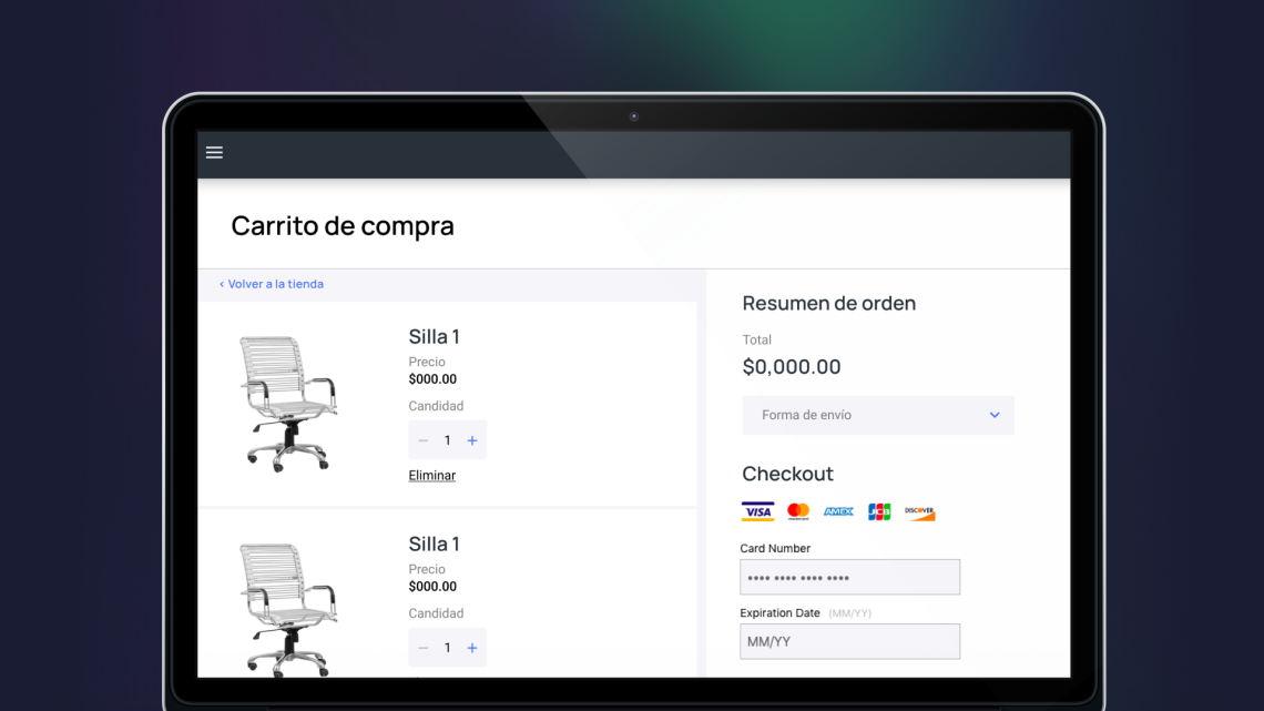
Detail view and shopping cart:
A closer look at the individual elements is important. As with the list of elements, it was necessary to define the structure of the content that we could display for all product types, although it may or may not exist for all entries.
Clicking on the cart icon activates a right-side panel displaying the shopping cart, ensuring a seamless transition from navigation to item management and checkout.

Payment process:
Once the user begins the checkout process it is crucial not to overwhelm the user with too much information, but still keep in view what the user is purchasing to give them certainty. In this part I designed mockups for each stage and multiple proposals for each step to ensure that we could adapt to different types of product and purchase, such as digital products, or home delivery of food.
 Mockups_pago2
 Mockups_pago1


