AD Network Launch
My team contributed to the launch campaign of a new AD network part of a big conglomerate by designing their landing page. We were allowed a ton of creative freedom to help illustrate the playful and cutting edge image the brand wanted to give for their launch.
Concept Development
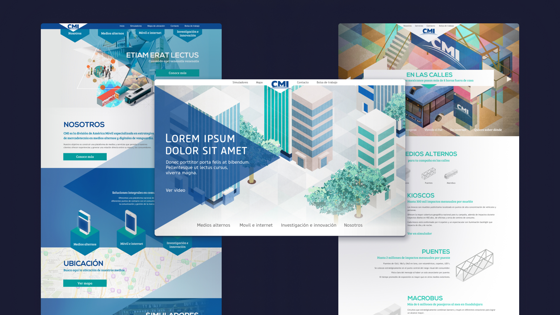
At the outset of our collaboration with CMI, the brief was relatively open-ended, with a focus primarily on content requirements. As a new team eager to make a substantial impact with their debut, they lacked extensive brand guidelines. Our initial proposals aimed to marry this existing logo with a complementary color scheme aligned with the parent company's branding. Given the absence of high-quality photography showcasing their advertising spaces, we proposed generating bespoke assets from scratch. Using an isometric grid, I sought to illustrate representations of these spaces. This framework let me have flexibility in the level of detail, perspective and proportions while evoking the urban context these ad spaces inhabit.

Initial proposals, including the one that was developed further (in the middle of the image).
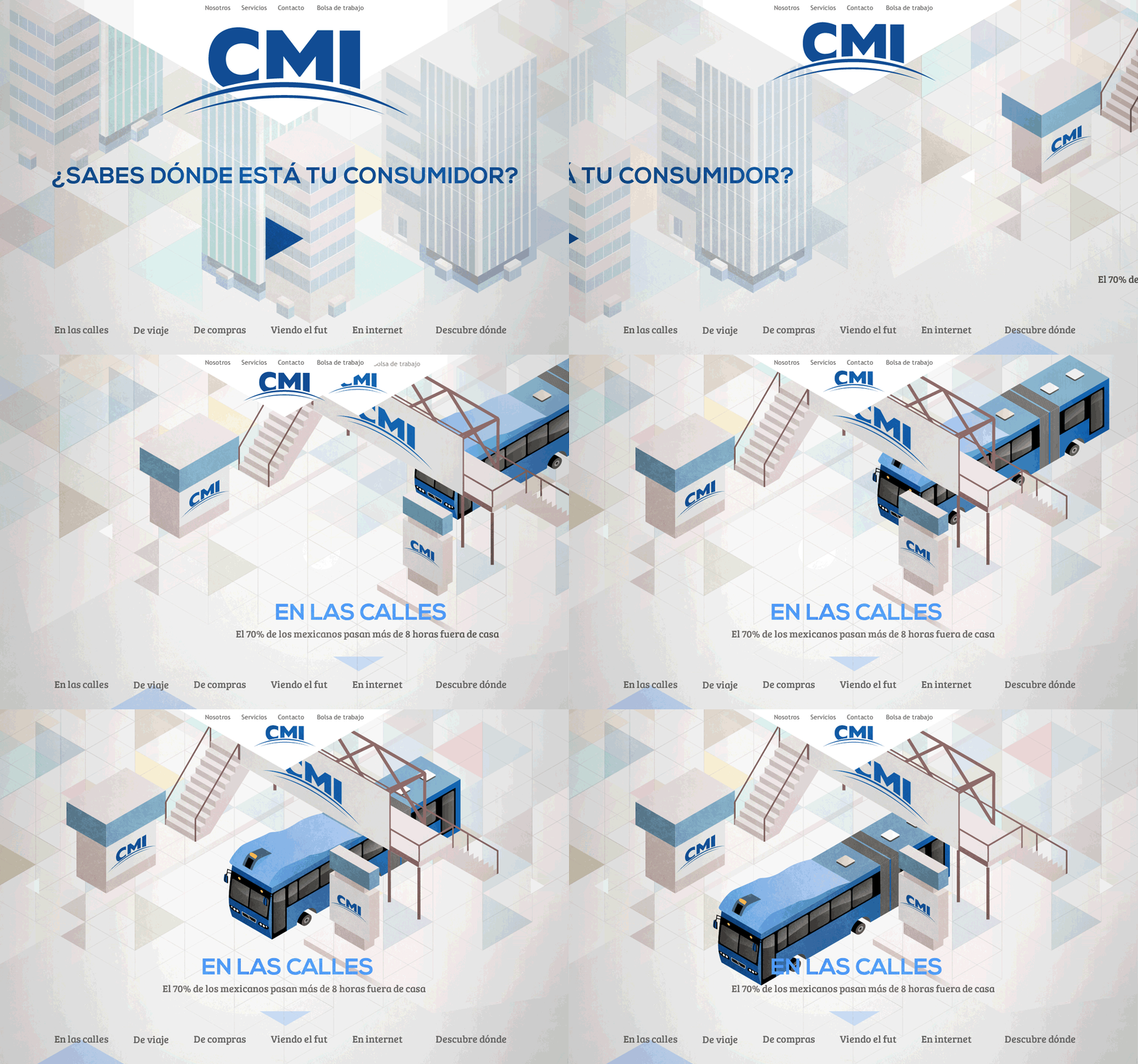
Following the initial proposal stage, the concept of a full-height landing page with a background city illustration resonated strongly with the brand image CMI sought to project. Encouraged by their receptiveness, I felt inspired to explore the construction of the lanscape with an isometric grid, proposing the integration of a seamless carousel with subtle animations. I collaborated closely with the development team to realize this vision. While technically challenging, our concerted efforts and strategic approach ultimately ensured the feasibility of this visual feature.

Animation mockup for a presentation with the client.
To enhance animation performance, we adopted a strategy inspired by the video game industry, separating background and foreground elements into large sprite sheets. Additionally, we incorporated small GIF animations into select sprites to elevate the complexity of the animations.
![]()
Some of the sprite sheets we used combined
Finalization and Mobile Optimization
In the concluding phase, we collaborated closely with the CMI team to define the content structure. Each section was assigned a distinct background color, serving as a cohesive visual thread throughout the interior content pages. Following common carousel design conventions, we integrated intuitive navigation elements such as arrows and a bottom navigation bar with labels. Additionally, we introduced interactive dropdown arrows to facilitate seamless access to all content, including a direct link to their video presentation.
.jpg)
Prioritizing mobile compatibility, we developed an alternate version of the full-height layout optimized for scrollability. Retaining the original illustration as a static Hero banner, we preserved visual continuity while adapting the design to suit mobile viewing preferences.
.jpg)
Further Impact
The website launch proved highly successful, serving as the cornerstone of their launch campaign. Our design not only garnered acclaim but also formed the foundation for more of their promotional materials. Leveraging the graphics and visual guidelines we created, they integrated our designs across various mediums, including displays on screens within their ad spaces.


